2015 – 2019
LLamasoft had a proud history of giving it’s customers the best Supply Chain Design tool with it’s Supply Chain Guru (SCG) software. SCG allowed users to build a digital twin of their supply chain, optimize their network, and run “what if?” scenarios against it.

By 2015, SCG was in it’s 8th version and over a decade old. The business and engineering leadership set the task of building a next generation version of the venerable software. It would harness all the new technologies available, incorporate features from acquired products, and leverage all of the company’s hard-earned domain knowledge. Nothing was sacred. Everything was to be reconsidered. It had to be extensible and serve as a foundation for at least a decade of future development and enhancement. Most importantly, in the words of the company’s founder, the product had to be “kick ass and fun.” I joined the team after development had begun on what would come to be called SCGx.
You may be asking yourself “what is a “model” in this context and how does one use it to answer business questions?” At the most basic level, a model is a collection of data that describes a network of nodes (e.g. customers, production facilities), connections between nodes (e.g. transportation routes, production methods), the thing that move between nodes (e.g. products, raw materials), and the rules that affect how those thing move between nodes (e.g. transportation policies, taxes and duties). Once the source data is put into the data tables, it can be “run,” or fed into a software solver to have various mathematical operations performed against it in order to get results. You can then adjust that data to explore different business scenarios.
It takes a lot of data to model the supply chain and distribution networks of major, Fortune 500 corporations. At the heart of a SCG model, there is a schema of over 150 data tables that store pre- and post-processing data. Models can be huge, easily reaching multiple gigabytes in size. The biggest challenge we faced in SCGx was giving the user easy ways to import, manipulate, interpret, and export large amounts of data easily.
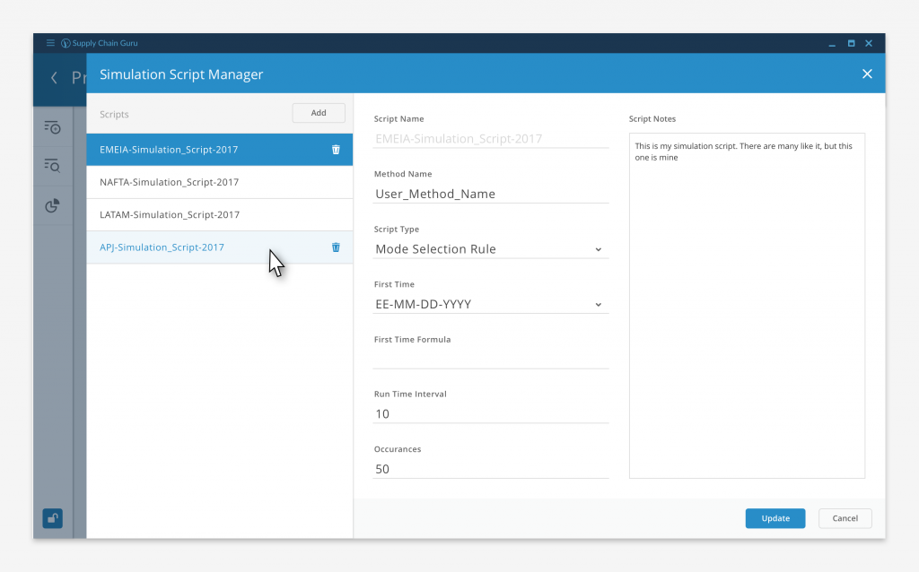
One of the first challenges we faced was how to divide up the functionality in a way that gave us both firm guidelines for the sake of consistency and freedom to build out new capabilities in future version of the software. We settled on two levels of tools, application level and table level. Application level tools, like the Simulation Script Manager pictured above, affected the model as a whole, either touching the entire data set or affecting the entire model run.
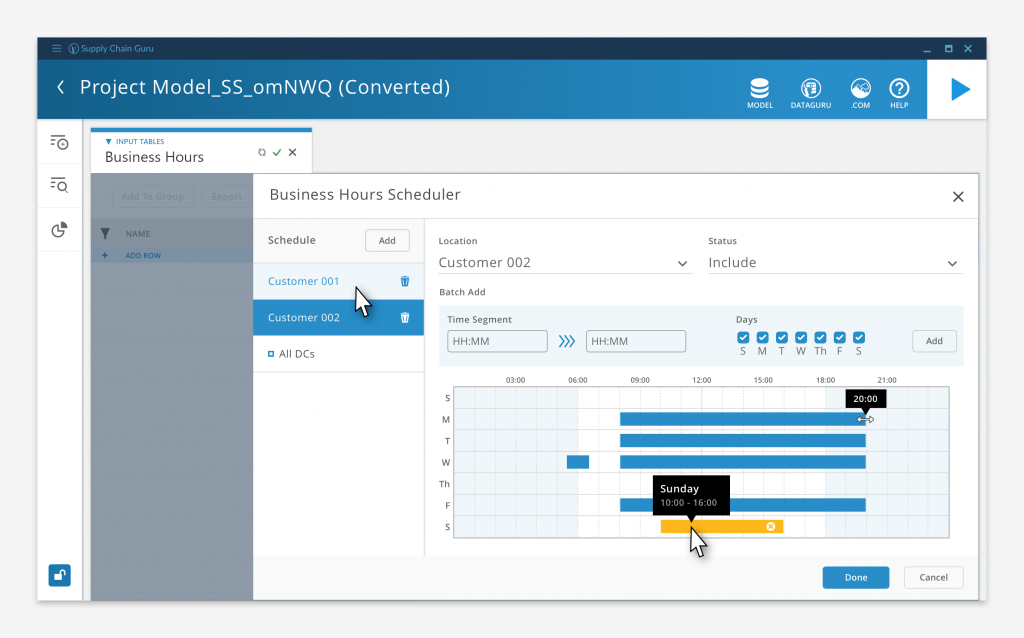
Table level tools, like the Business Hour Scheduler, operate only on a small subset of the data. Rather than forcing the user to master the arcane terms and structures of the underlying schema, they can visually configures settings and values, leaving the software to populate the necessary table fields. These tools are contextual to the tables they populate which decreased the number of controls we had to expose at any one time. This allowed us to streamline the interface and decrease clutter. The business questions our users are trying to solve are complicated enough as is, the last thing we wanted to do was to have an overly complex interface increase their cognitive load.
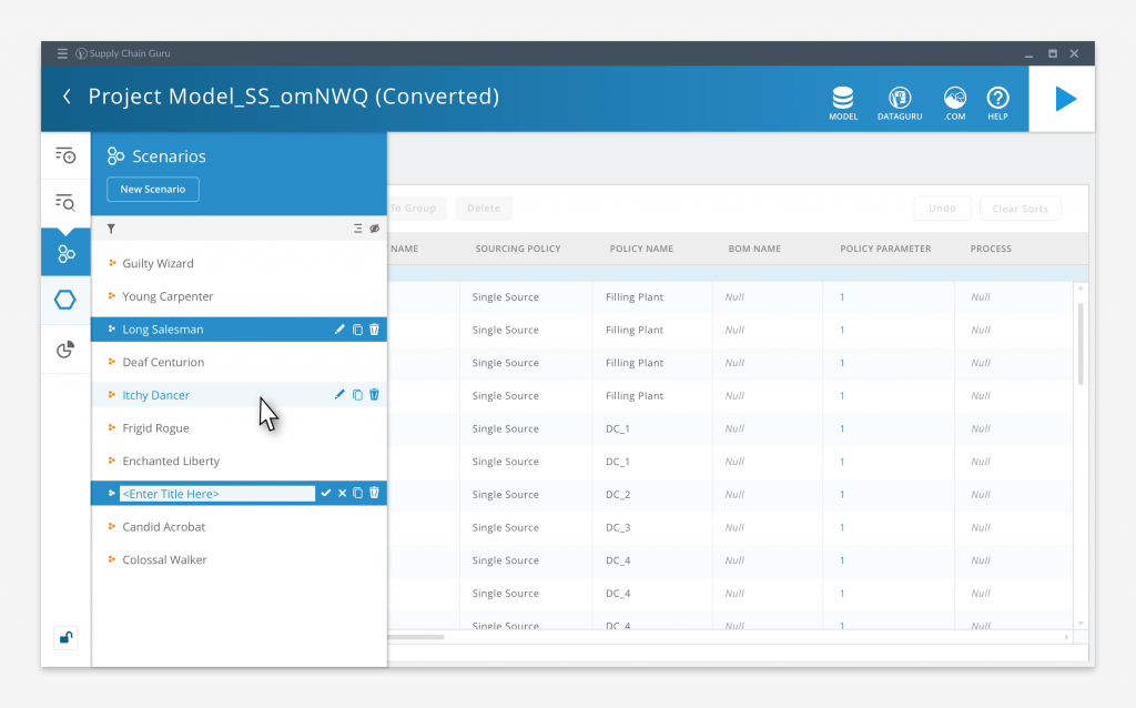
The main interface itself was intentionally spare, our goal was to minimize the chrome and controls in order to maximize the user’s work area. The left hand control bar had twelve selector buttons, divided into three collapsible groups, that would call up a list of a specific content type.
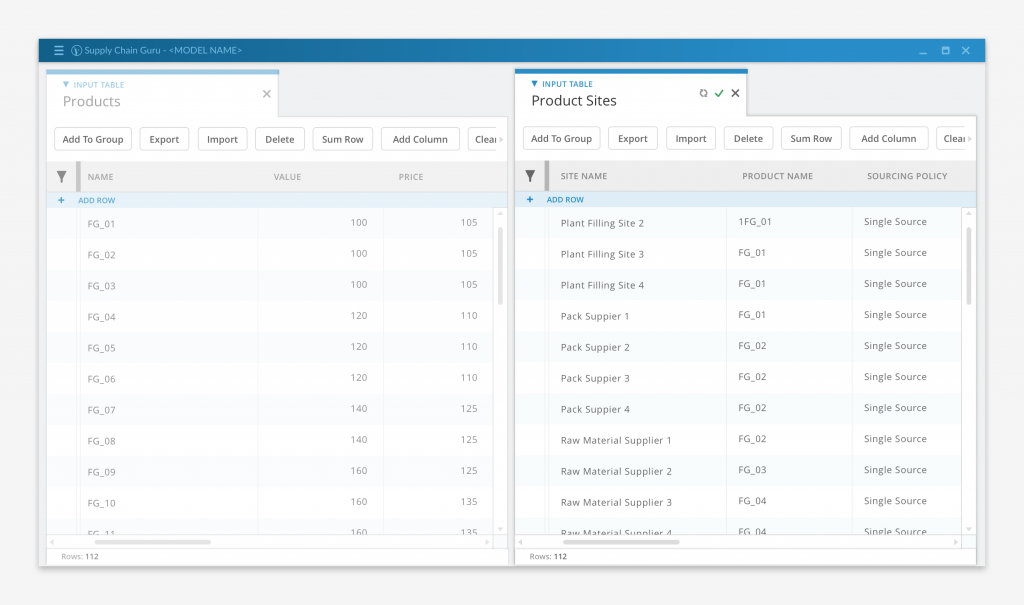
From that list, user was able to select specific data tables, visualizations, or other content to view or work with, and open it in a tabbed, user configurable work space that could be split across multiple screens.
Big data going in means big data coming out. With potentially millions of records being generated by a model solve, we needed to find ways to help the user view and interpret their results.
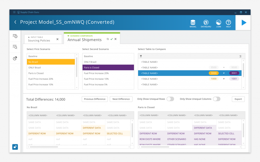
Above is a Scenario Comparison, a way to quickly compare the results of running two “what if?” scenario solves. Say a user wants to evaluate two sets of potential transportation policies for their company. After setting up and running scenarios for each option, the user can create a Scenario Comparison for one of the transportation-related result tables. The Comparison highlights all of the differences between the two scenarios, and allows the user to view them side by side. The user can also sort and filter the data to highlight specific differences.
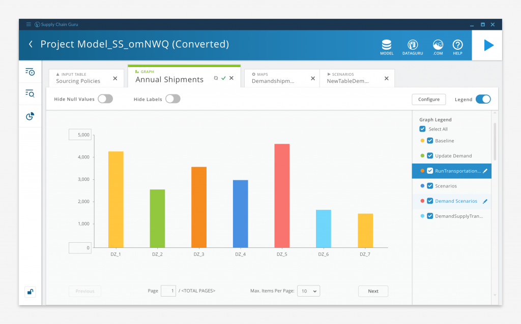
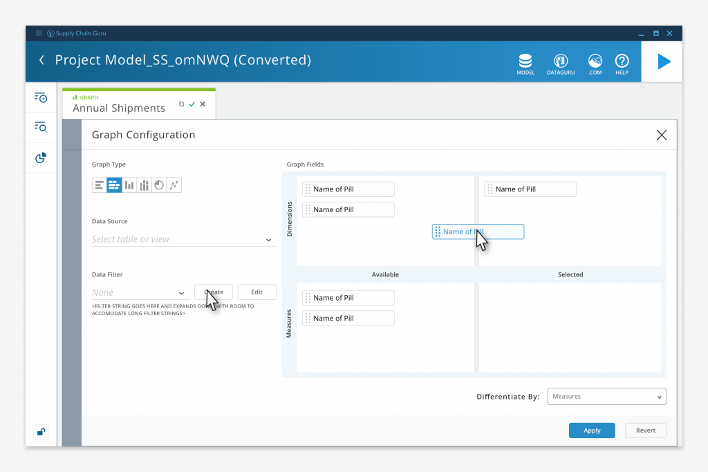
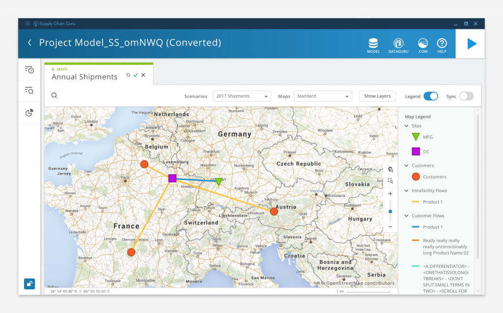
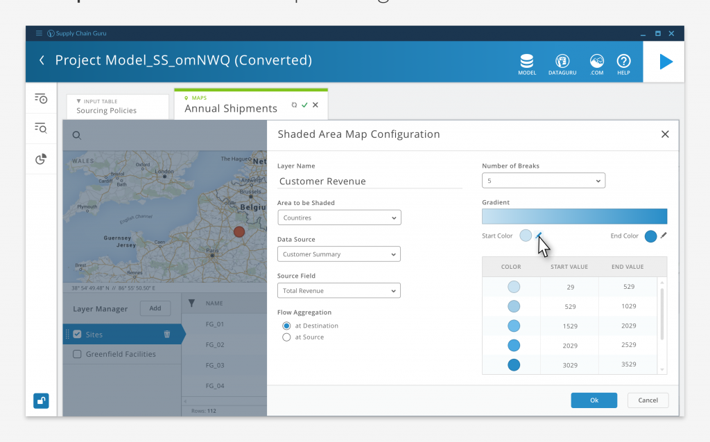
While some of our customers used Tableau or other third party applications to visualize their data, LLamasoft didn’t want to be entirely reliant on external vendors to realize the full value of the software. So we included robust graphing, mapping, and dashboard capabilities so users could visualize their results without leaving the application.
It became apparent over time that users wanted to have more awareness as to what was happening to their model while it was solving. At the same time, our Applied Research department had expanded the capabilities of the solve engines to allow greater visibility into the status of the solve.
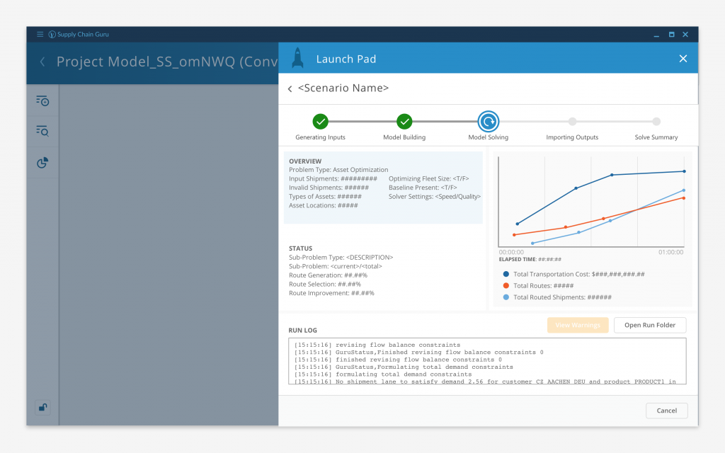
And so, Solve Tacker was born: a means to provide the user detailed, real time insight about the state of their solve. Each step of the execution process was broken out on to it’s own tab and each solve type had it’s own customized layout. We even added the ability to drill into any warnings that were generated during the solve process.
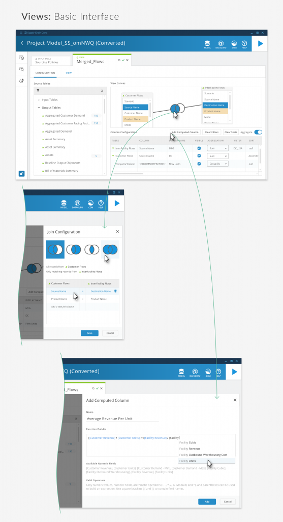
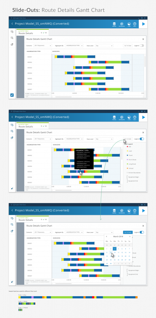
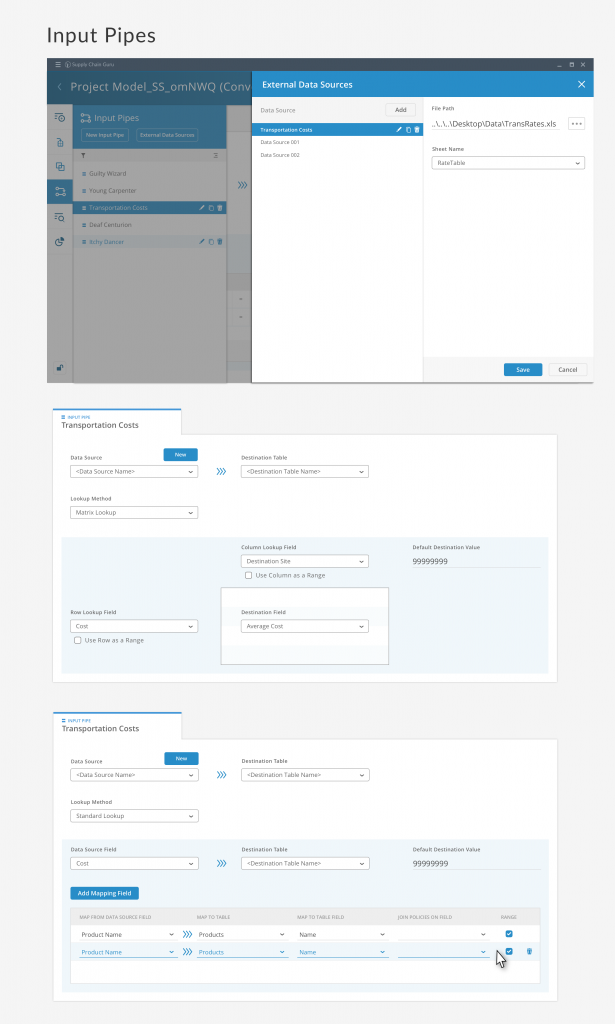
Here are some other assorted screen designs.

