February 2024 – February 2025
One of the requests we often got from wind farm operators was to find a way to help them identify serial issues throughout their fleet. If we could discover a pattern of damages at a specific wind farm, we could help the customer target their repair and inspection efforts to prevent catastrophic blade failure.
It can be difficult to see patterns in your data when you’re only looking at a spreadsheet; it can be quicker and easier to interpret reams of data when you’re looking at it represented visually. Our data sciences team had been working with image processing systems and had put together some bespoke plots as part of a warranty claim project. This got me about how we could do something within the system with any customer’s data.
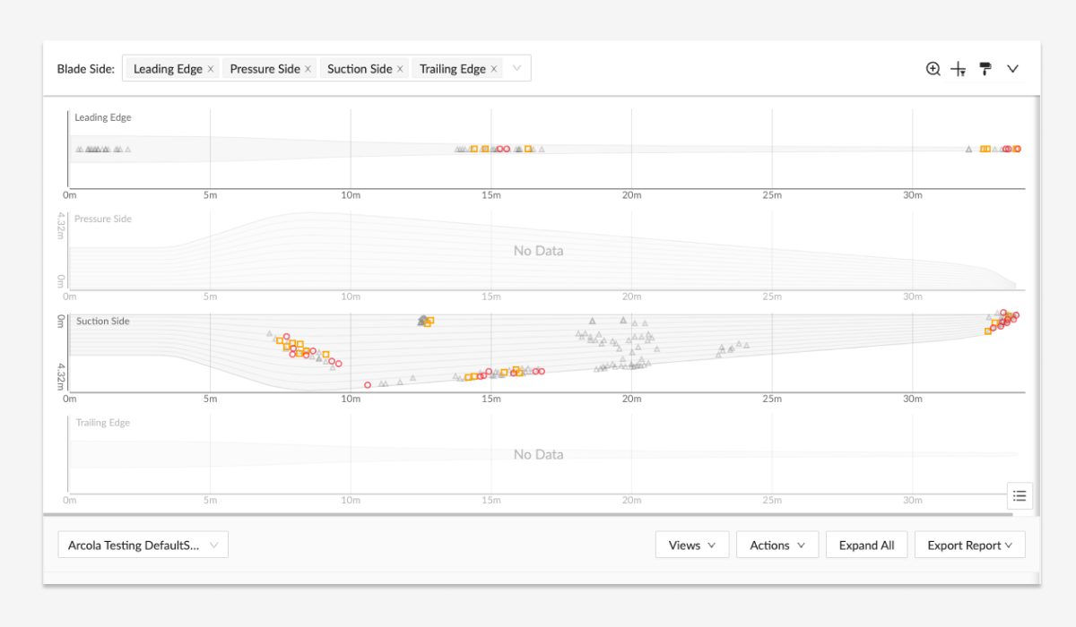
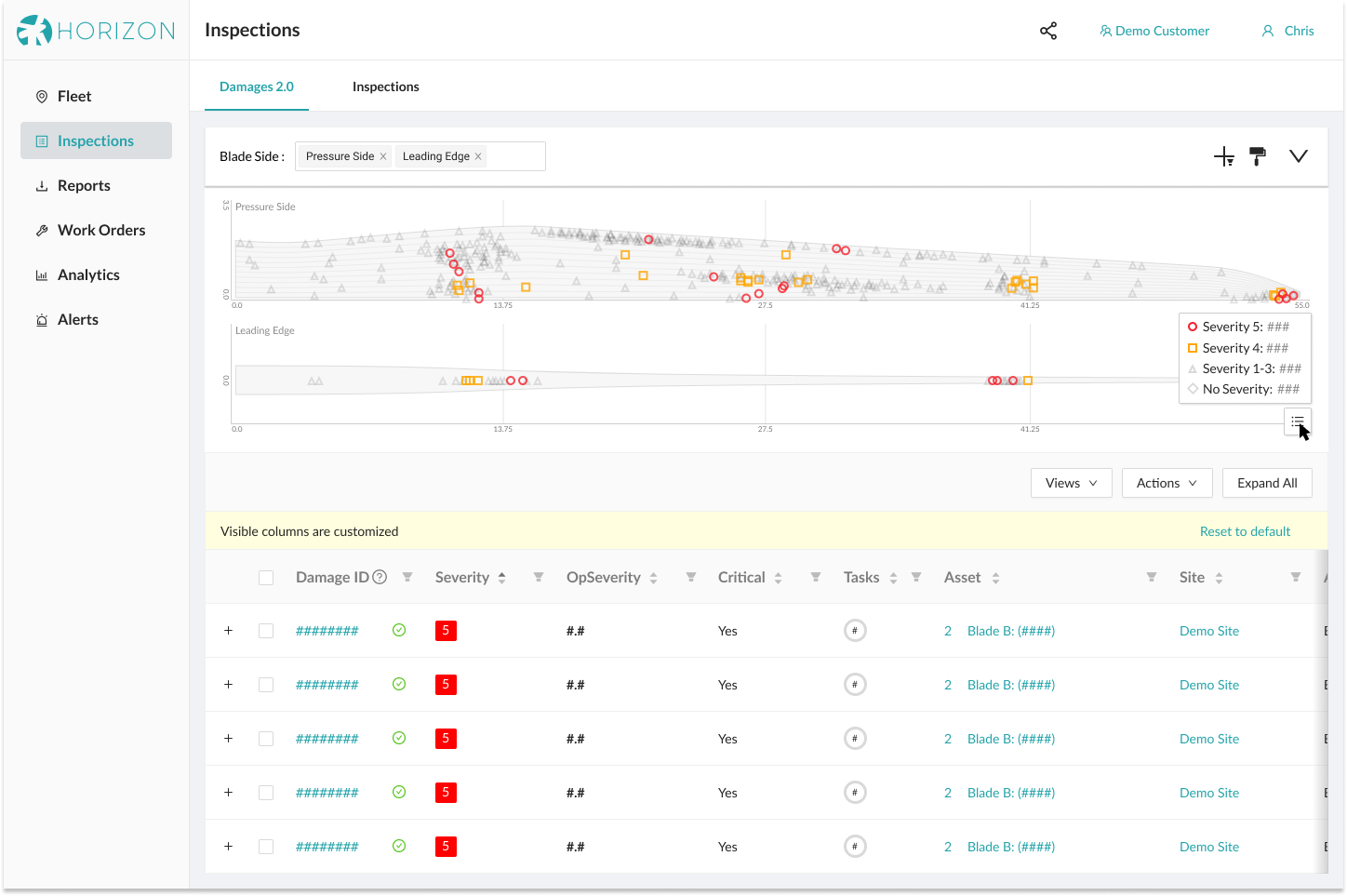
If we could plot the location of all the damages on all the blades of a specific type (potentially hundreds of thousands of points), it would be easy to see where damages were clustering. Adding styling options would make it easy to see where damages of a certain type, or damages of a given severity, were located. Pairing this with the filtering abilities of our Damages table would let the user dial in what they were looking for, letting them find damages that required extra care and attention.
I met with power users and subject matter experts to learn as much as I could about how they think about, and look for, serial damages. Using the results of these interviews, I drew from a wide variety of influences, ranging from audio recording software to air combat video game interfaces, to put together an initial sketch of a solution. My primary goal was to have the visualization be closely tied to the where the user interacted with the data, to make it easy to integrate into other work flows rather than have it being a navigational dead end. My secondary goal was to design a versatile, reusable, future-proof component that would be available for novel future uses.
Using the basic structure I hashed out with paper and ink, I began playing around with elements and structures, figuring out how they fit together and how users would work through the use cases we were targeting and looking for interesting possibilities we hadn’t considered. This was blue sky, brainstorming, work; trying to get a whole lot of options out on the table so that the leads team, consisting of myself, our senior-most Engineer, the Engineering Manager, and our Product Manager, could decide what would be in our initial scope, what we would pursue later, and what we’d conscientiously decide not to do. After these initial decisions were made, I continued fleshing out the concepts into higher fidelity mock ups.
As I polished the mockups for the concept, I worked with the rest of the leads team to put together a technical write up about what we were building and why we were building it. After rounds of comments on Notion documents and Figma mockups and the attendant revisions, we had something we were comfortable putting in front of the wider development team. We started talking through feasibility, roughing out time lines, and evaluating visualization packages. As the developers began rolling out code, we began putting the feature in front of internal users for testing and feedback.
As the developers continued to build, the Product Manager and Engineering Manager continued to collect feedback from the initial user testers. Some of the feedback required rethinking our initial assumptions, like the size and shape of the blade diagrams. Some of the feedback caused us to address some issues we’d missed in the early process, like the original button positions making it too easy to accidentally close the plot, requiring the system to re-render before it could be viewed again. And some of the feedback were nice-to-haves that were easy to implement and greatly improved the quality of life for the user, like adding damage counts to the pop up legend.
By the time we were ready to launch, we had a new feature that surpassed even our most ambitious initial goals and our internal users had already used it to proactively find one suspected serial failure. In all, this added a new feature to our software that not only benefited our users and helped create value for our SaaS customers, but it also helped us stand out as a leader in an increasingly competitive market place.
(additional process-related materials available upon request)